


Updates on the COVID-19 School Response Dashboard
Hard data on kids and schools! We know this is the stuff you subscribed for

If you’ve been keeping up with COVID Explained, you’ll recall that Emily (alongside the School Superintendents Association, the National Association of Elementary School Principals, the National Association of Secondary School Principals, and Qualtrics) recently launched the COVID-19 School Response Dashboard, the largest and most robust nationwide data collection effort on schools.

We have a page about the effort here on the site and as a reminder, if your school or school district would like to enroll, you can do so here.
But we don’t want to bore you with too much verbiage about the data. Here it is in infographics and graphs (much easier to digest, we think).

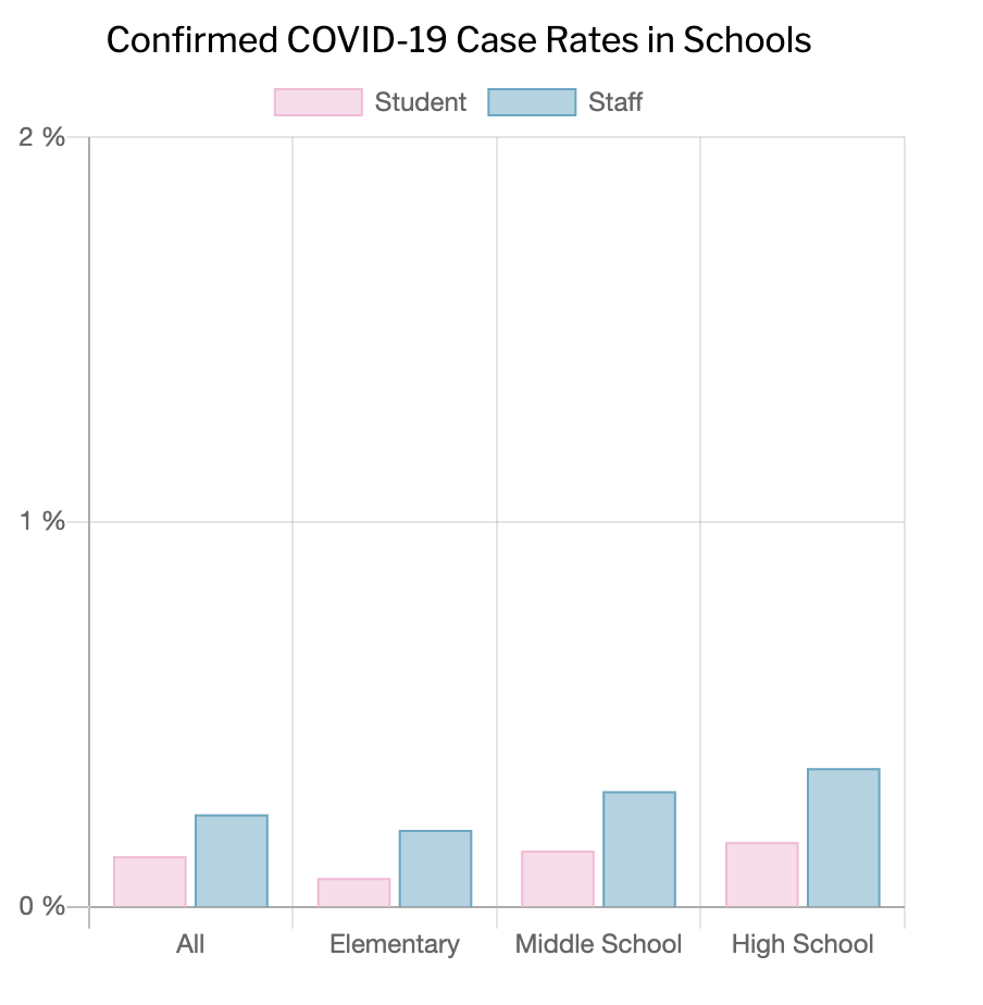
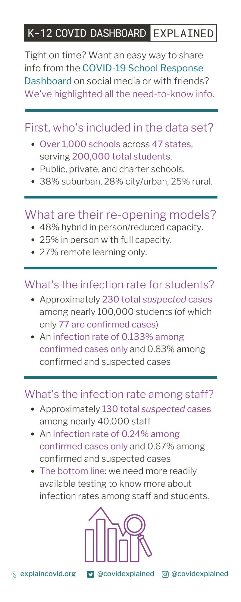
Just to unpack this a little: we can break down the data by infection rate among students and infection rate among staff. Schools that have brought students back in person reported a total of 230 cases among just under 100,000 students who attended school in person during the two-week period covered by the dashboard. According to guidance from the Centers for Disease Control and Prevention on school reopening, 230 cases per 100,000 over two weeks falls into the red or “highest risk” category.
If expressed as a daily case rate, that would be 16.4 cases per 100,000 people per day, which falls in the “orange” or next-to-highest risk level category set by the Harvard Global Health Institute and the Brown University School of Public Health.
It’s important to underline, though, that just 77 of these 230 cases were confirmed by coronavirus tests — the bulk are “suspected” cases, which could be run-of-the-mill colds or fevers.
Schools in the database reported a raw total of approximately 130 cases among nearly 40,000 staff members over the two-week period covered by the dashboard. That rate is in the orange, or “higher-risk” category, according to the CDC school guidelines.
As a daily case rate, that would be 49 cases per 100,000 people per day, which is in the “red,” or highest, risk level category set by the Harvard Global Health Institute and the Brown University School of Public Health. Again, the case numbers include just 44 confirmed cases and twice as many suspected infections.
About half of schools responding to the survey were running in person at reduced capacity to allow for some social distancing. About 1 in 4 were running in person at full capacity. The rest were remote only.
Interestingly, schools with remote-only learning plans reported an infection rate among staff similar to that of schools running at full capacity. This could indicate cases brought in from the community rather than contracted at school. On the other hand, in some places teachers are being asked to teach remotely from their classrooms and infections may be passed among adults in a building.
And of course:
This issue was adapted in part from this article from NPR. Please feel free to share your thoughts, questions, and concerns — you can get a hold of us via email, Twitter, Instagram, and the site itself.